How to design GREAT looking web pages......a primer for non-professional web page designers |
Part 3: Aligning objects vertically and horizontally |
| 3. Alignment |
Align objects on your web pages, both vertically and horizontally. |
|
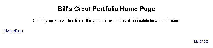
Example of a web page with mixed alignment. In this example, the centering of the title and subtitle throws off the alignment of the page. Further, the links are not aligned. While written reports can have center alignment, web pages should usually not have center alignment as different monitor sizes will throw off the alignment for different viewers. |
| The same web page, now with a consistent left alignment and a horizontal alignment of the links. What was "messy" looking is now clean and professional looking. |